
Go Overseas Marketing & UX
Background
During the summer following my freshman year in college, I interned with Go Overseas, an online travel and study abroad site. I got the chance to work on both the company's website redesign and their international partnerships.
One of the most important things about a study abroad program aggregator is the ability to foster a community for its alumni and prospective students alike. Building a community was a top-of-mind long-term goal for Go Overseas and that motivated every piece of work I touched while interning at this company - from web redesign to social media posts.
1. Web Redesign
Problem
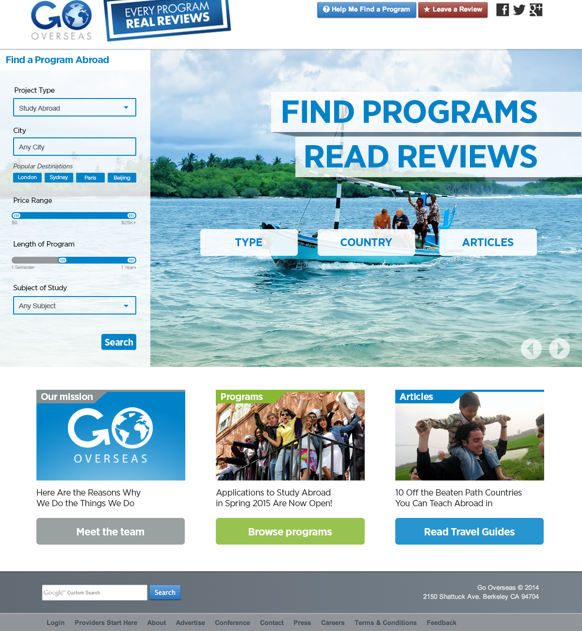
The company experienced really high bounce rates, meaning that when people get redirected from a search engine or aggregator they spend only 3 seconds or less on the site. This was an indicator of poor user experience and mismatched content. Additionally the website was not getting traction from the company's core target audience: 18-24 year old American students; instead, most of the site's traffic consisted of middle aged women from outside the US. The website's general aesthetic seemed out of line from what a young student would expect from a reliable and credible source. See a snapshot of the site from summer 2014 below:

Action
I set out to give the site a more youthful and modern flare through the following changes.
- Color: instead of the dark grey and blue current employed by the site, I suggested the brighter combination of white and orange
- Search: implementing a searching and filtering option like other flight or hotel booking sites to create an easier programs browsing process
- Peer reviews: 18-24 year olds love sharing and absorb most information through peer reviews. I decided to add review and rating features to each study abroad program in order to improve the credibility and sense of community on the site
- Content: I added links to additional relevant content, such as articles, packing lists, etc. to keep the student browsing.
See below for a study abroad in China landing page mock up I made with each change and new feature explained:
I tested out a few different layouts (shown below), and still finally decided on the version above because it offers the most straightforward navigation. In addition to the study abroad program landing pages, I also made a few mock ups using the same thought process for the website's homepage.


2. INTERNATIONAL PARTNERSHIPS
Problem
Go Overseas wanted to gain more scale through partnerships with organizations and institutions of global stature. One of its key objectives was to win partnership deals with tourism departments of various popular study abroad destinations.
Action
I worked directly with the CEO to draft and illustrate some fun partnership proposals for the tourism department of Australia. In the partnership, the Australian Department of Tourism would offer full study abroad scholarships through the Go Overseas platform to encourage students to visit Australia. The partnership proposal included a splash landing page and many on-site pop-ups that promote the scholarship.


3. Travel Guide
Outside of the two major projects, I also picked up the role of assembling and designing a travel guide with original content from the company's riders. They were to be distributed as promotional material to prospective students. You can find the complete guide here.
Result
The travel guide was distributed at all of Go Overseas' on-campus info sessions. The company did successfully win the Australia partnership (!). Its website also went through some major changes since I left and I'm so grateful to have been a part of the evolution!
Miscellaneous
I made a bunch of miscellaneous illustrations of each member on the team and for some daily social media posts that I was curating. See a sample collection below:


![[Fri] Summer Treats FB copy.png](https://images.squarespace-cdn.com/content/v1/59dfdd042994cac77559e816/1520119527842-2HWV0J1J5S9MYMU1P388/%5BFri%5D+Summer+Treats+FB+copy.png)
![[Mon] No Regrets.png](https://images.squarespace-cdn.com/content/v1/59dfdd042994cac77559e816/1520119657132-AFKL9AEP3CLKFPU55RAP/%5BMon%5D+No+Regrets.png)
![[Wed] Belloc.jpg](https://images.squarespace-cdn.com/content/v1/59dfdd042994cac77559e816/1520119670860-OWLK2XDHKEKBZ2GRVTTX/%5BWed%5D+Belloc.jpg)
![[Mon] Walsch Twitter.jpg](https://images.squarespace-cdn.com/content/v1/59dfdd042994cac77559e816/1520119658975-ODFZXLA36G7D6TRIZFC9/%5BMon%5D+Walsch+Twitter.jpg)
![[NEW] Banner Scholarship.jpg](https://images.squarespace-cdn.com/content/v1/59dfdd042994cac77559e816/1520122004706-W94L506YL0AEAMDGHPZN/%5BNEW%5D+Banner+Scholarship.jpg)

