Forté Web & UX Design
Background
In the fall of 2015, a few Berkeley alumni asked me to help design a non-profit music platform they were looking to start. It is an online platform that connects teachers with young aspiring musicians and facilitates affordable lessons for those who wouldn't otherwise be able to afford them. I began to work with the team from the very beginning where we brainstormed the product's audiences and features, and I later created high fidelity visual mockups of various user experience paths we envisioned. Because of the early-stage nature of the project, my job was not only to create an end product that could be coded and pushed live, but also to help the team visualize and bring to life the ideas we tossed around on conference calls so we could effectively critique and iterate throughout the creative process.
Challenge
Forte's platform has three separate audiences: teachers, students, and parents. Teachers would see a completely different interface and experience than students and parents, who would be operating on the same account. Forte's main goal was to be simple and intuitive to use even for the less tech-savvy crowds, such as young students or older parents. Forte was a young idea without many similar web platforms that I could draw inspiration from.
Action
After initial discussions, I created a draft user experience animation that illustrates the user journey for both student and teacher and highlights all the key features of the platform.
After this version was shared across the team, we noticed a few things that needed to be improved on for the next iteration.
- Color scheme: the overall color scheme was too somber and we needed a lighter and brighter color to foster a friendlier atmosphere for young students
- Clutter: pages were too busy and navigation flow was hard to follow as a result
COLOR
We began brainstorming colors that reminded us of music and/or instruments. Olive green and walnut wood came to mind first, but were later dismissed as being too dark and unappealing on a web page. Working with the colors of different types of wood, we finally decided on a light cream orange as the theme color of the site. It took hues from the wooden color of music halls and orchestra instruments and embodied the levity and energy that we wanted to see.

FLOW
When there are too many options on each page, the user becomes confused and overwhelmed. In the next iteration, I wanted to outline every frame of a user's journey so that I could make sure it was streamlined and that each node had no more than 4-5 actionable options. To ensure that the flow is logical and that there are no loopholes for each user's experience on the site, I created the following process map.
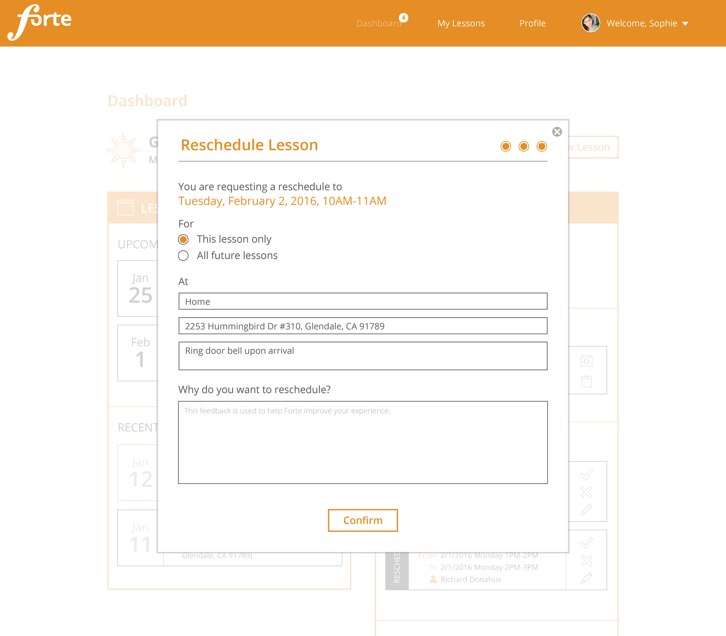
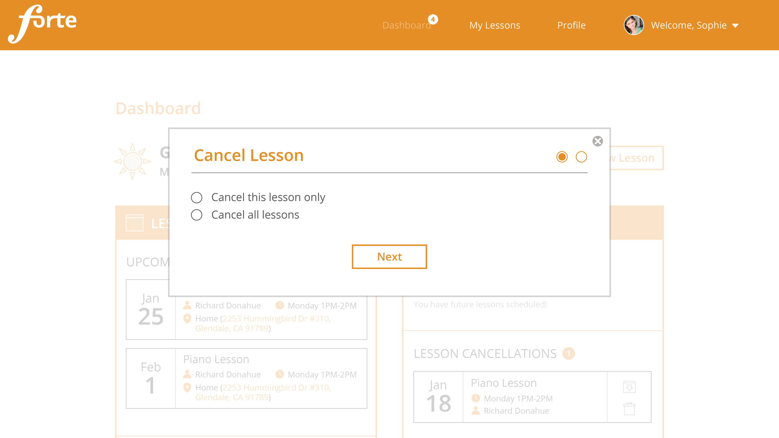
FINAL PRODUCT
I later made each of the numbered frames above into visual mockups. You can flip through all the mock up pages below:


Result
The site is now live at https://www.forteacademy.org/, where students and teachers get connected for music lessons everyday!
Miscellaneous
Outside of the core user experience design, I also designed the organization's logo and made a few custom illustrations and icons for the website.